On User Experience (UX) - simplicity, usability and security
I had to make an important call last night. Quite unfortunately, it was too late to go out and get a recharge card. Then it struck me credit topup is something I should be able to do online. Easily. Paga came to my mind first. I was welcomed with a security question as I tried logging in because I was accessing the site from a device I have never used before. Turns out I also can't remember my password. So, after 2 or 3 tries, I got a sms saying my account is locked. *sighs*.
Topup Genie was next. The home screen welcomed me with login and signup forms. There was only a PIN field for registration and when I tried it, I got a "name field can't be empty" error. And that was it. Irony of it is there is no name field in the registration form.
I really don't understand our interest in complicated solutions when prototyping products and web services. We are designing for humans and not angels. Paga's login action for example is about 4 steps, 4 browser refresh. And really, does security questions work? The security questions are built on personal info that can easily be guessed or found out in this age of social network frenzy. I mean the city or town I earned my first pay? My facebook profile will bring you close to that. I am even more surprised my account was locked after just 3 tries. A 3 try window is too short. Introducing a login delay (in seconds) after 2 tries and exponentially increasing it for up to say 7 tries would have been a better (usability wise) idea.
@pystar hinted me about quickteller (after a few twitter rants). It was nice to find mobile top-up cards right there on the home page. I had to register though. And the registration form? Unnecessarily long. I was emailed an activation token that only worked after I switched browser. I registered anyways but my debit card failed. Well, I don't know who to blame here - my bank or interswitch.
Usability is a very strong part of design/development that many of us are still missing.
- It is not compulsory for a user to register on your site if you can offer the service without collecting his/her personal data.
- If you must provide a registration form, please make it work and simple. I really don't understand why Quickteller has Title and Date of Birth fields in the registration form. And no, I don't need their birthday wishes.
Don't include optional information fields in your registration form. If you must collect the data, move it to the user profile so he can edit his profile and add that later when registered. - Logins should be painless. And please, let users choose their passwords. It's ok to set a standard, e.g. the password must contain numbers and must be more than 7 characters but please, let them choose. We easily forget passwords you generate for us.
- Be forgiving. Locking an account after 3 tries is hardcore. And that I have to "call a customer support" to activate the account? Not so cool. Recovering/Resetting password should be as easy as following an email link.
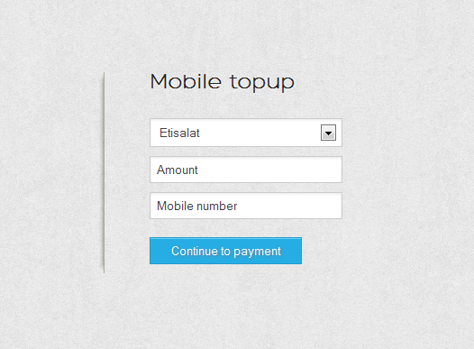
Well, that was how I couldn't do a simple, easy mobile topup that night. Like seriously, an easy topup?! I see no reason why there can't be a topup site as simple as this:

Maybe I should just build one.